
Use the Pricing Cards Module to clearly demonstrate the difference between tiered offerings and give users a way to buy your product.
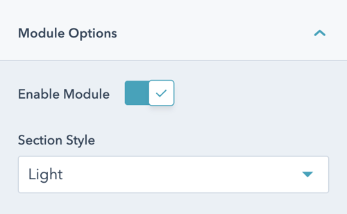
Once the module is selected, you can begin editing the pricing cards to fit the needs of your website. Under Module Options, you can set the section style by choosing between light, dark, primary, secondary, or tertiary styling.
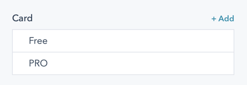
Add and manage pricing cards via the list view.
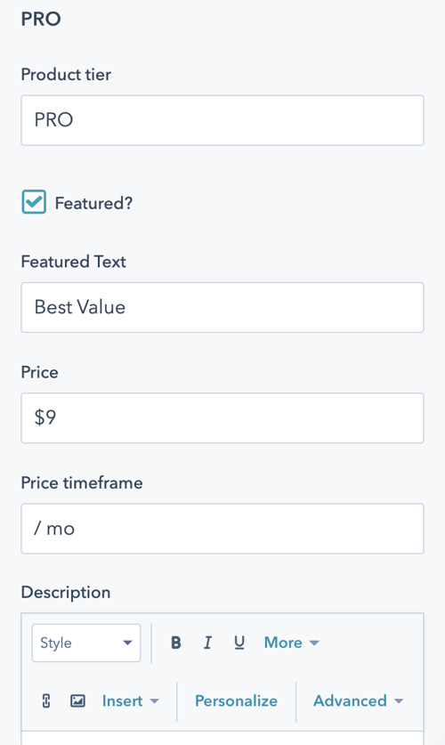
Click into each pricing card to edit the name of the product, featured text, pricing information and a description. You can also determine which product is featured, which places emphasis on the product card comparative to the other cards.
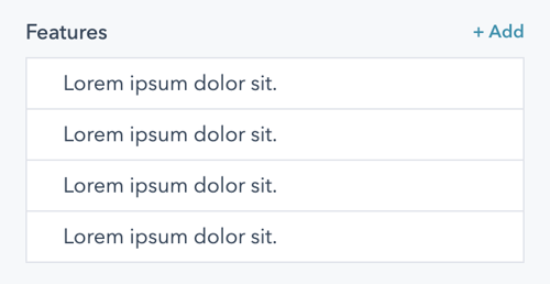
Add in features for each product offering, which will display as a list on each product card.
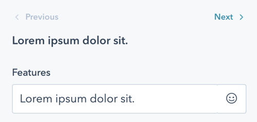
For each feature, you can set both the description text and the icon.
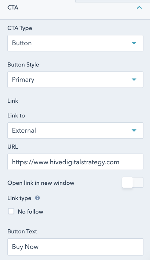
Finally, you can easily set a CTA for each pricing card using the CTA dropdown. Customize the type of CTA and the styling, as well as the destination link and linked text.