
Use the Slider Blocks Module to display content blocks in a slider to add interactivity and interest to your design.
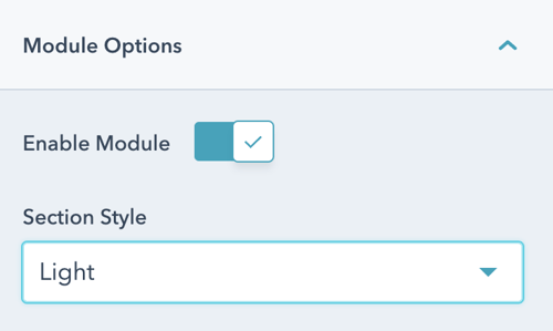
Once the module is selected, you can begin editing the blocks to fit the needs of your website. Under Module Options, you can set the section style by choosing between light, dark, primary, secondary, or tertiary styling.
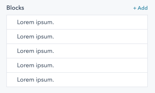
Add and manage blocks from the list view and click into each block to edit the contents.
Give each block a title and edit the content.
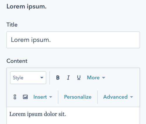
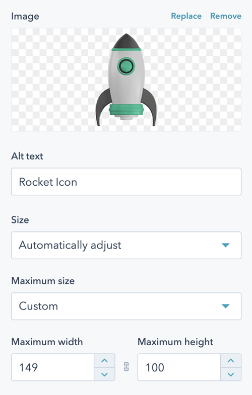
Here, you can also add an image or icon to each block and manage image sizing.
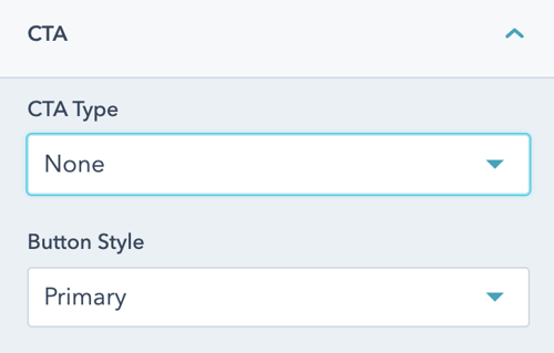
Next, add a CTA to the block under the CTA dropdown. Select the type of CTA and set the style.
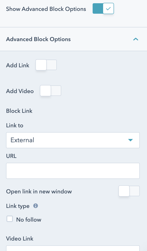
Enable Advanced Block options to add in a link and/or a video and set corresponding options for the block.
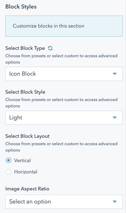
Slider Block Styles
Finally, you can set the styling for the blocks by clicking Styles > Block Styles. Here, you can choose the type of block, set the styling, and the image aspect ratio.