Accordion modules are a great way to add interactivity to your content because they allow for progressive disclosure of information with a click.
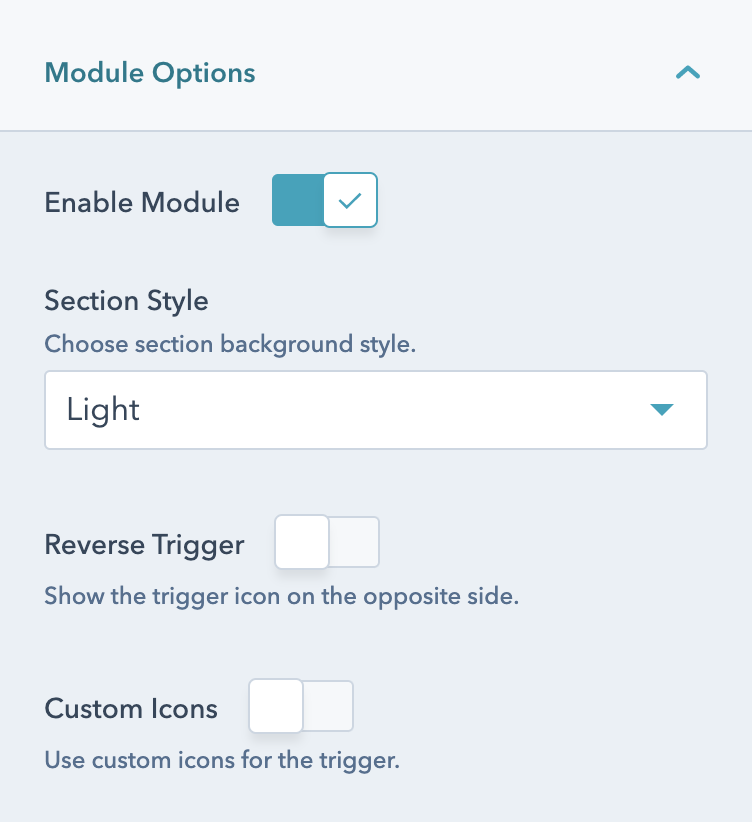
Shown with all default options.
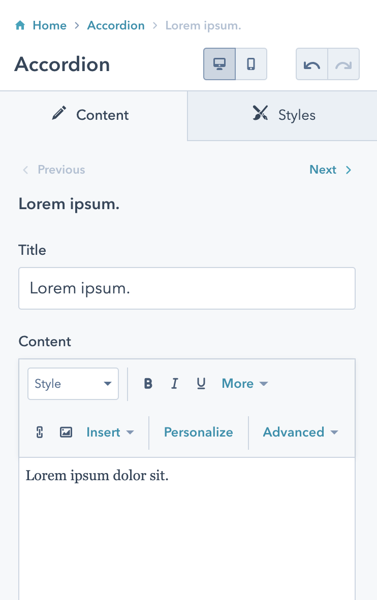
Lorem ipsum dolor sit.
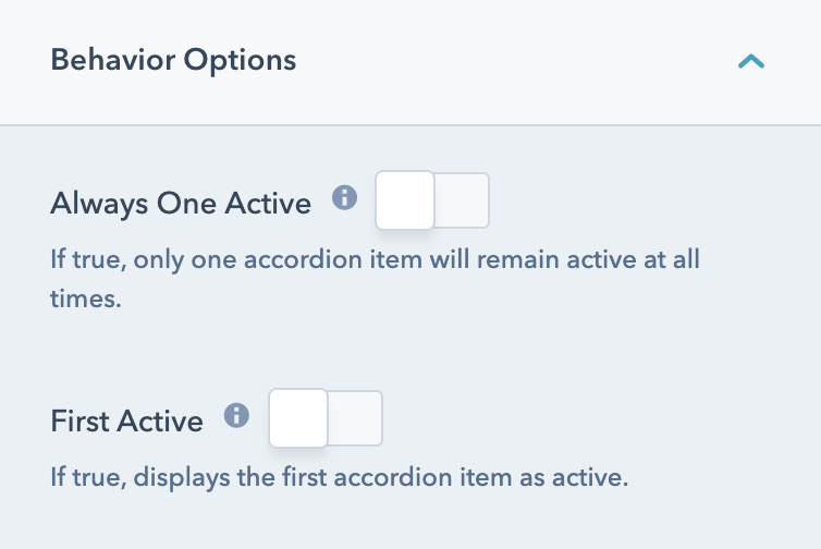
Show here with reversed trigger, custom icons, first active, and only one active allowed.


